Breakdown: Washington Commanders Logo and Brand
Washington's NFL franchise went through an 18-month process to select a new nickname, brand, and identity. Did it pay off?

If you're not an NFL fan or have been quarantined in your basement since March 2020 with no Internet connection and only a bag of Doritos to keep you company, then you might have missed that the Washington Redskins retired their nickname in 2020 and have played two entire NFL seasons under the ultimate generic name of the Washington Football Team.
That all changed on 2/2/22 when we got our first look at a new NFL franchise brand since the Houston Texans joined just over 20 years ago.
Setting aside the question of if Washington should have rebranded (because the Internet is full of commentary on that), we're here to examine and deconstruct the execution of the new brand.
From Washington
Full press release
More explanation on the branding

Analysis
Brand reveal video.
Everything points to this video as the place to learn about the changes. (Surpisingly no link to embed, which seems odd for 2022)
https://www.commanders.com/video/brand-reveal-video
The video is...fine. Thoroughly fine. Not bad, not great. Squarely mediocre (much like their team, which has only had a winning record 3 times since the new millenium, but I digress).
Calling back to the 'legends' of the past is the safe move. Reminds people of what makes the Redsk...Commanders great.
Still, I don't think it was wise for us to see the Redskins logo more than the Commanders logo.
Overall, I expected more from an NFL franchise. Brand reveal video = meh.
For the record, this is how it's done.
Logomark

Here's a side-by-side with the quick W they created for the Washington Football Team moniker 18 months ago. A few nice changes to make it more striking. But again, I expected more.

The new logomark looks like it has a subtle "1" on the right "piece" of the W, which I really like. Doubt it was intentional, but that's a win in my book.
Can't help but wish they had incorporated the Washington Monument or some Washington landmark into it somehow. The logomark lacks any tie to Washington DC, confusion with the state of Washington notwithstanding.
Other teams incorporate the local culture into the design.
The Houston Texans prominently integrated the Texas Lone Star into the logo.
The fleur-de-lis is the New Orleans Saints. End of discussion.
But the Washington Commanders logomark doesn't really say Washington or Commanders.
It just says W.

In spite of its ambiguity, the actual design of the W is unique and memorable, and hopefully that pays off in the long run.
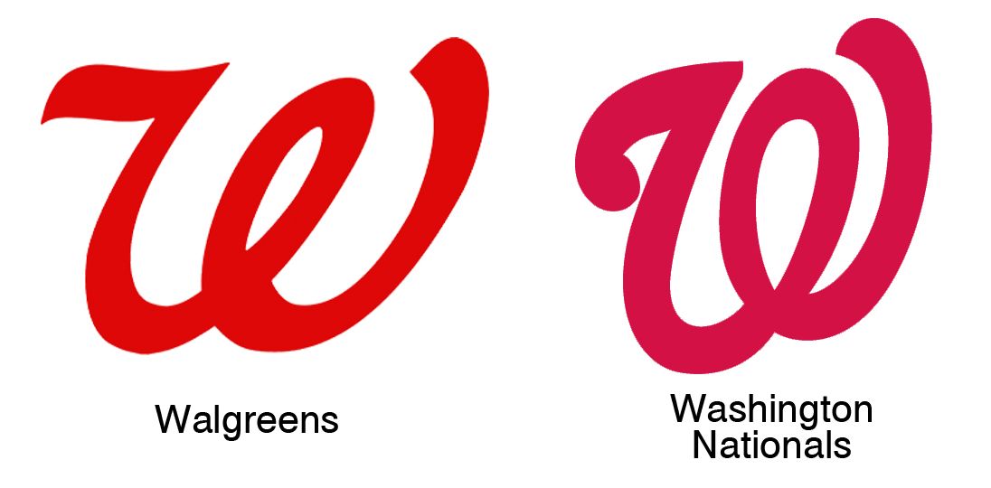
Of course, we could just call it a win that it doesn't resemble the style or color from the Ws of the Washington Nationals or Walgreens....
Wordmark
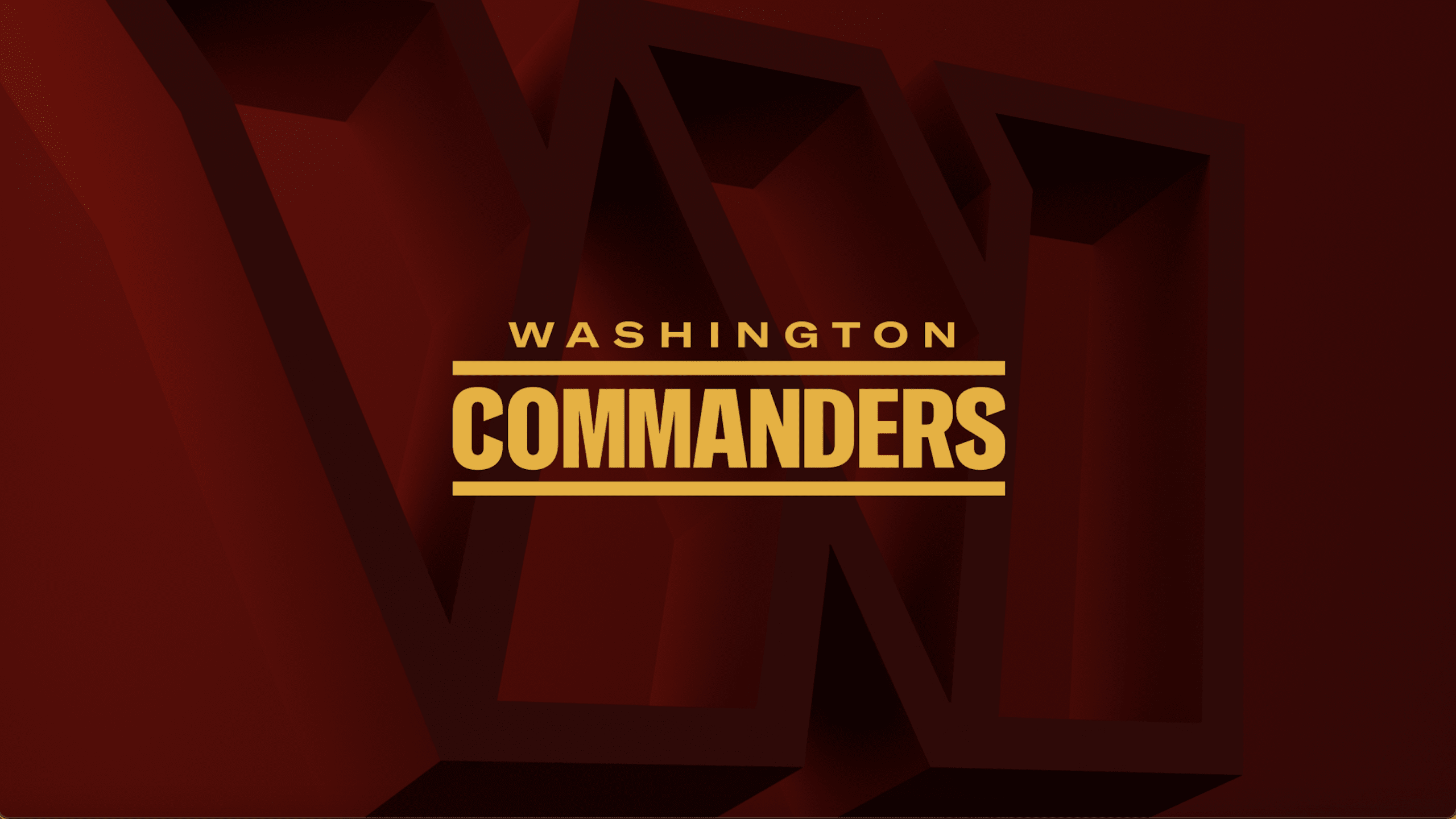
99 percent sure the typeface is Oswald. If not, it's a really close knock-off of it...check out this specimen from Google Fonts.

Hard to get excited about a generic font with stripes on the top and bottom. Feels extremely low-budget.
Selecting a typeface that's generic and free from Google Fonts does not honor the unique history of Washington nor evoke the prestige of an elite NFL franchise.
Seriously, spend some money and get a unique font from a type foundry.
Moving on...
The C and S were adjusted to have a more interesting angle.

I can't help but wonder, do the angles/cutouts have any meaning, or maybe the whitespace created by the angles? Do they connect to the angles of an award on a Commander's uniform in the US Army or something? I don't think the angles are bad necessarily, but I don't really understand how that design choice ties into the overall brand.
Now how about those two Ms....geez. Based on the specimen I created on Google Fonts, I think the designer kept them relatively untouched from the original font. Maybe it's just me, but those Ms look like they're stuck on the middle seat after boarding in Group C on Southwest Airlines.
Alternatives
Here are some of my favorite alternatives created by designers and posted on Behance.
Washington Warhawks
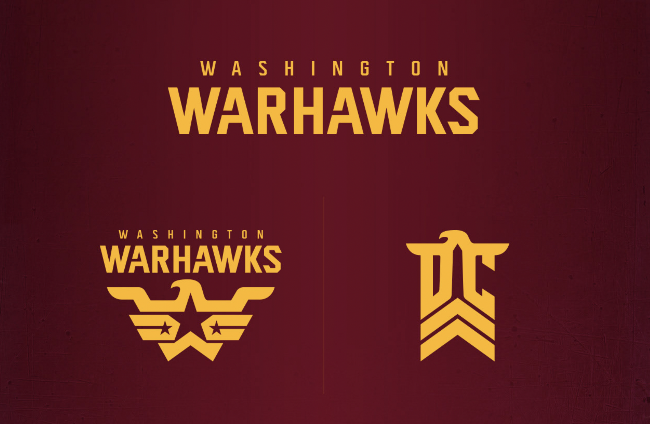
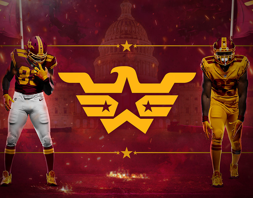
The wordmark is weak, but the logomark and alternate more than make up for it. Eagles and stars? Can't get more Washington/American than that.
Washington Redtails
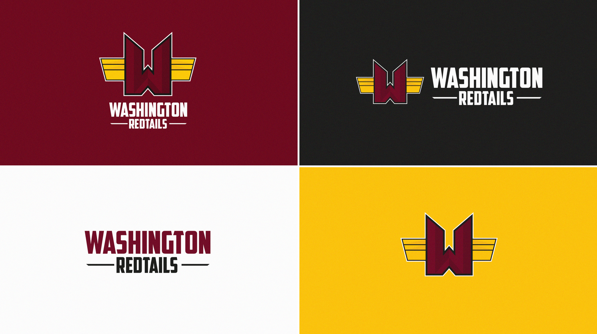
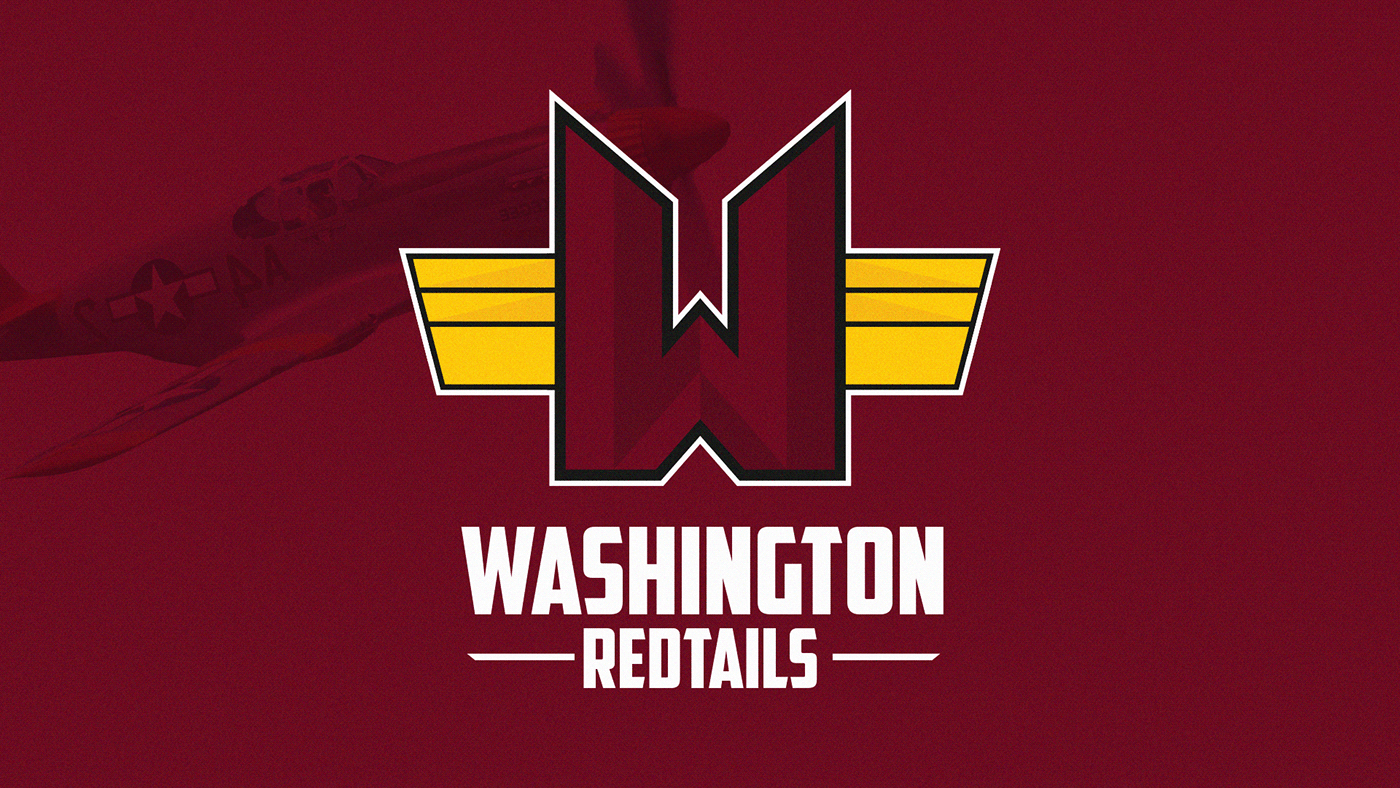
Why the Redtails you ask?
The name ‘Redtails’ is a nod to the WWII Tuskegee Airmen, who were the first African-American military aviators in the U.S. Armed Forces. The nickname ‘Red Tails’ comes from their planes, which had a distinct crimson tail. I believe this is a great opportunity to maintain the current brand's color palette, while at the same time giving historical meaning to the franchise.
Washington Redhawks
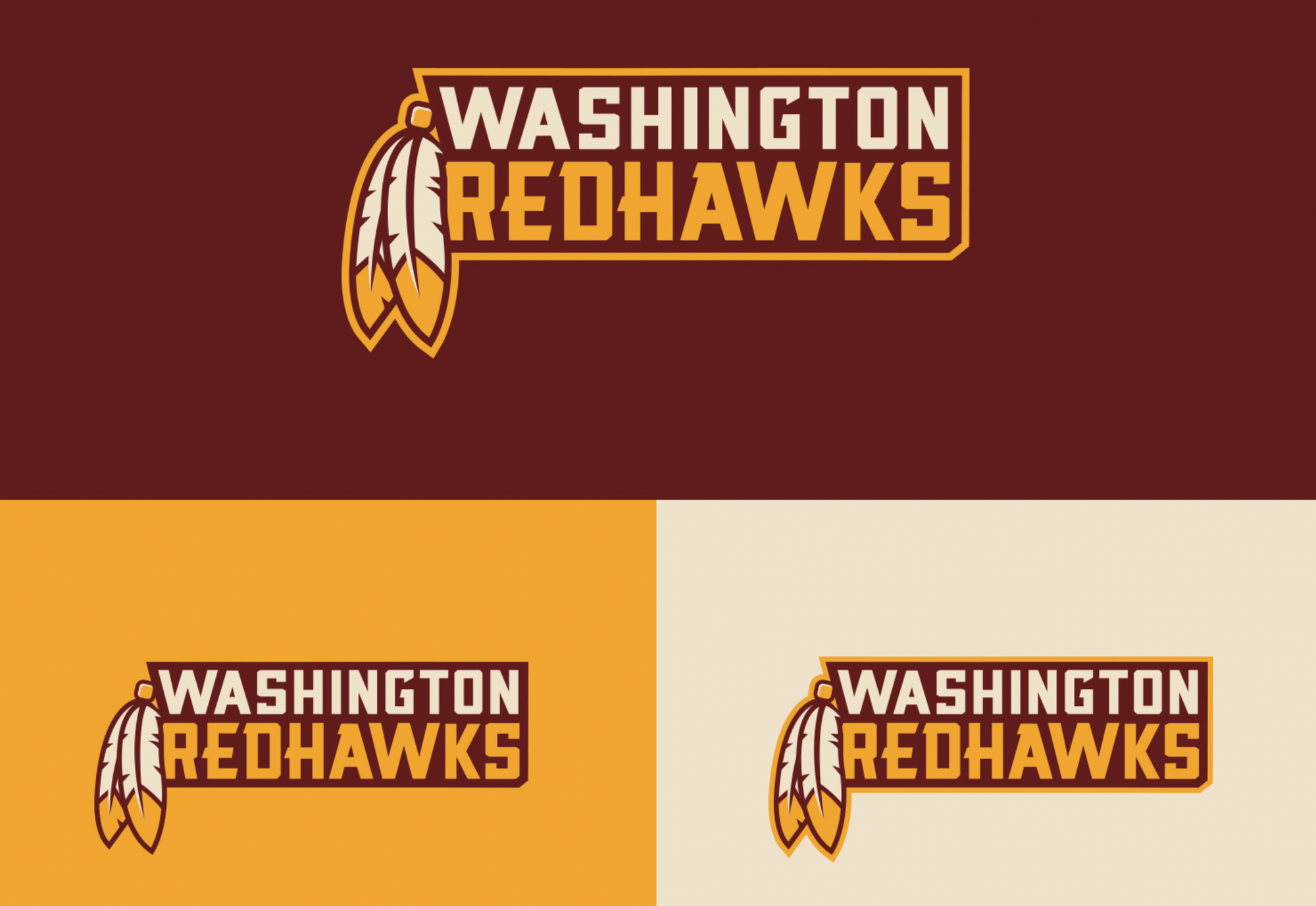
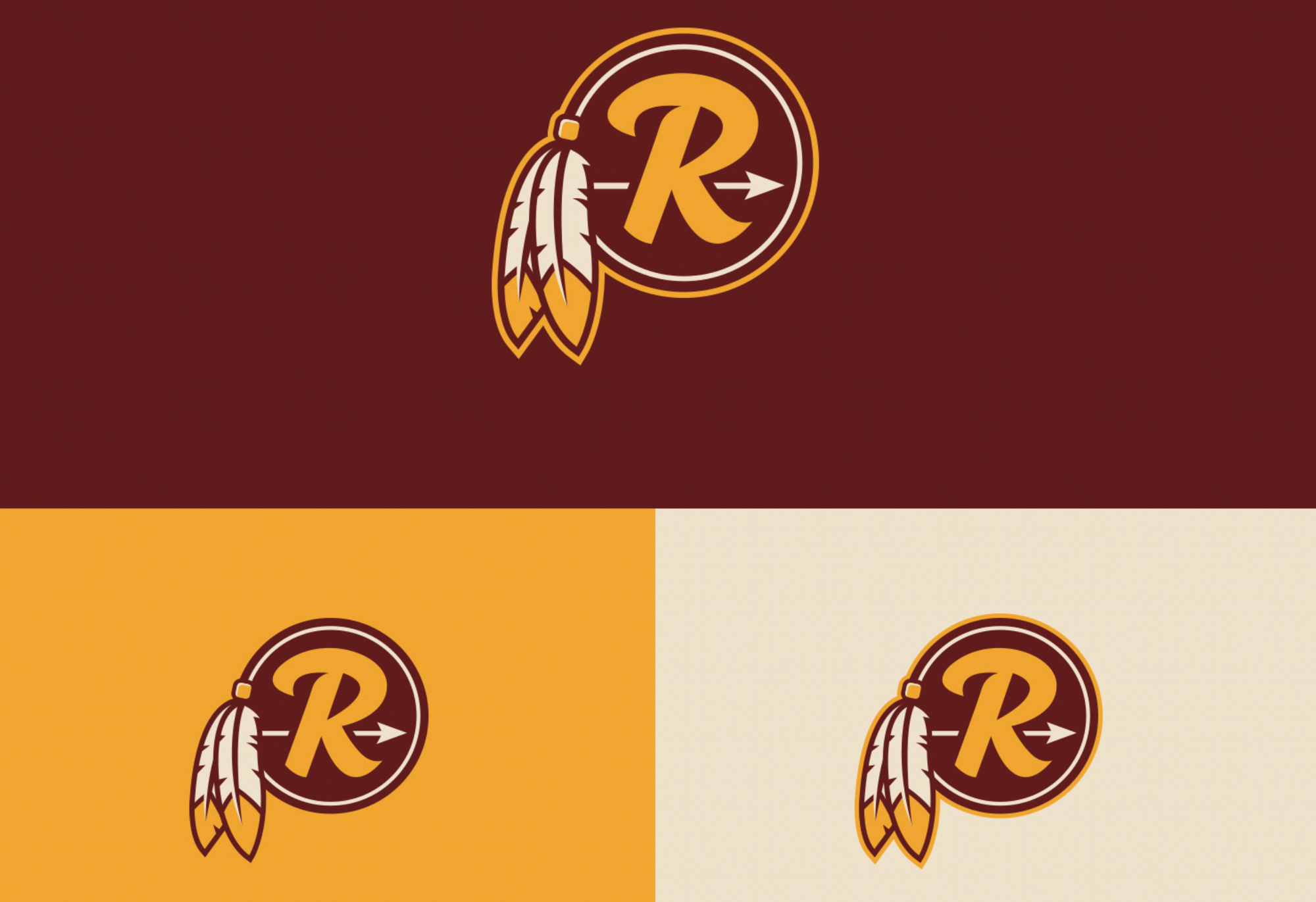
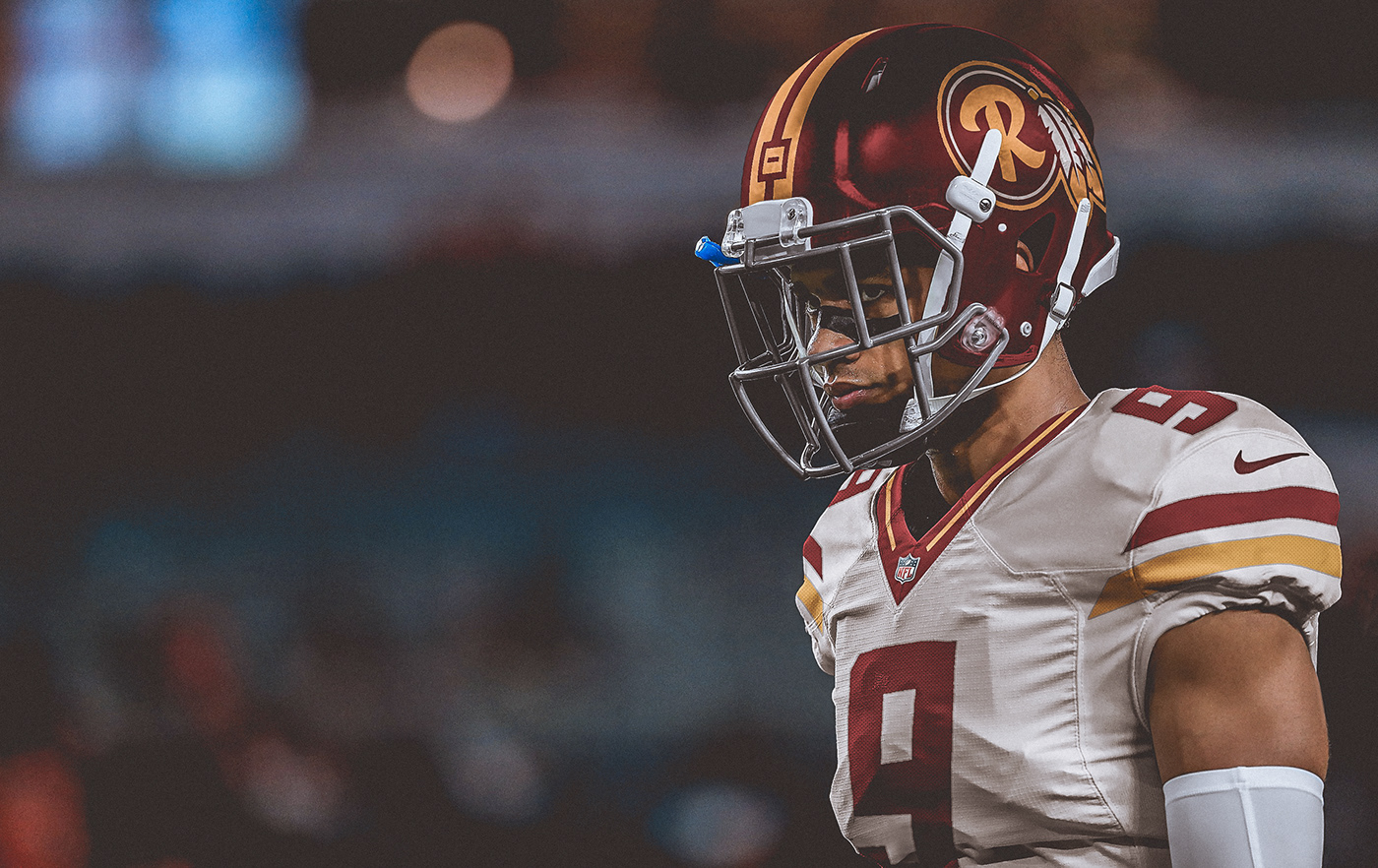
My favorite of them all. Brandon Moore really put some thought into this with good explanations for each change made. I love the way he drew from the geometric inspiration from the existing visual identity to create something both new and yet familiar.
Conclusion
Washington kept the classic maroon and gold colors. Besides that, I don't see how they honored the past or created an exciting future with their new identity. Creating a NFL brand is hard, which is why it was critical for Washington to create a unique attitude with their identity that the team could grow into (like the Rams did a few years back).
As it stands right now, we're left with a really solid high school football team design. No chances were taken. Nothing here is really all that memorable.
Then again, maybe after the media carousel they've been on the past two years, not being memorable was the goal of this rebrand from the very beginning.
