Early look at NBC's New NFL Graphics Package
The Super Bowl LVI Pregame Show debuts NBC's new NFL graphics package, and we're taking a look at what we know so far.

Another Super Bowl means another TV networks rolls out a fresh broadcast graphics package, and NBC is wasting no time showing their new look in today's Super Bowl LVI Pregame Show.
Lower Thirds: Standard
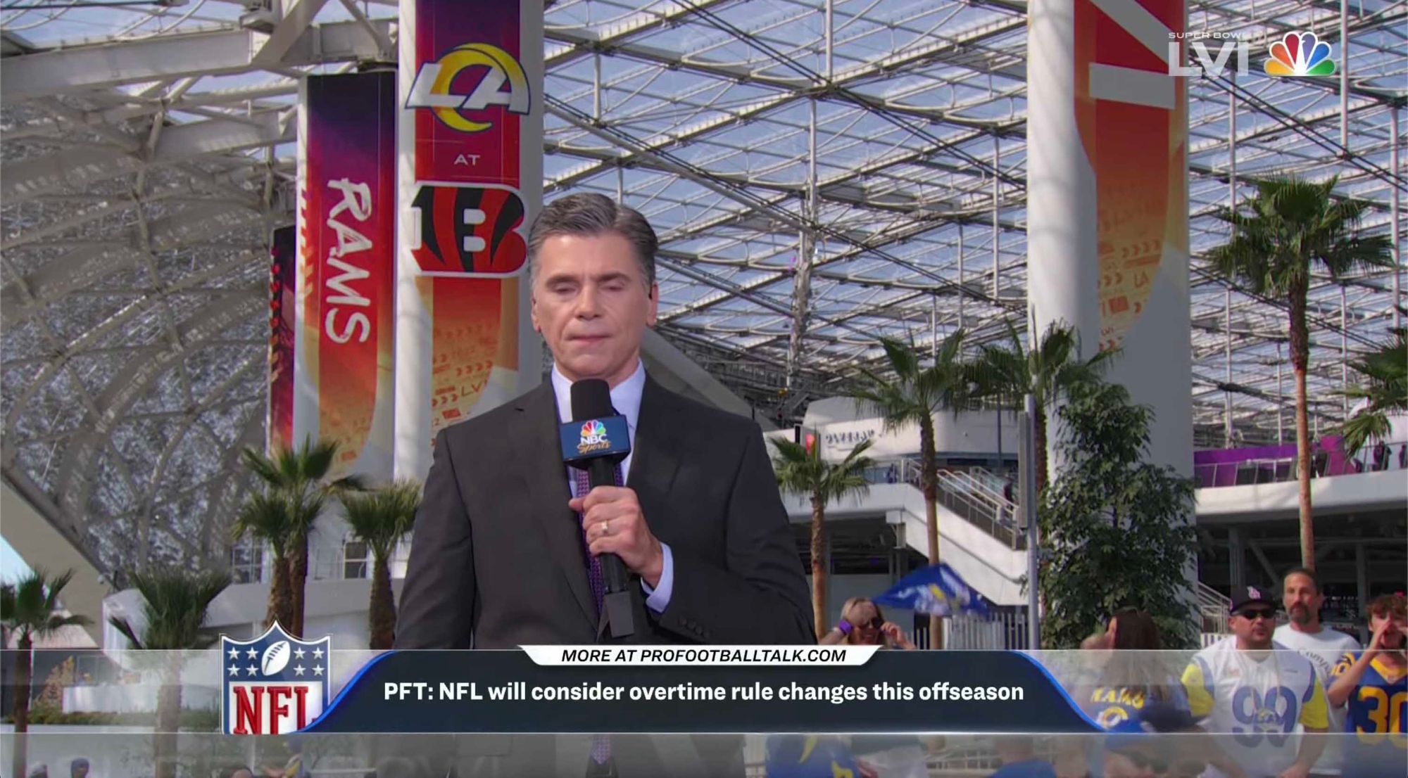
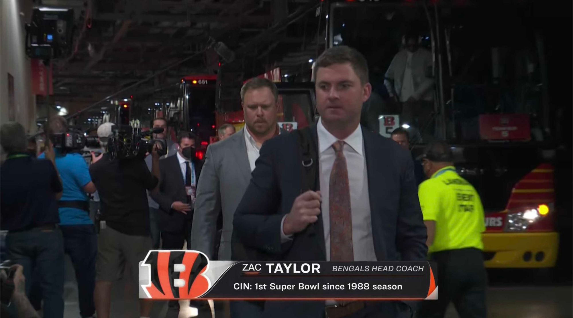
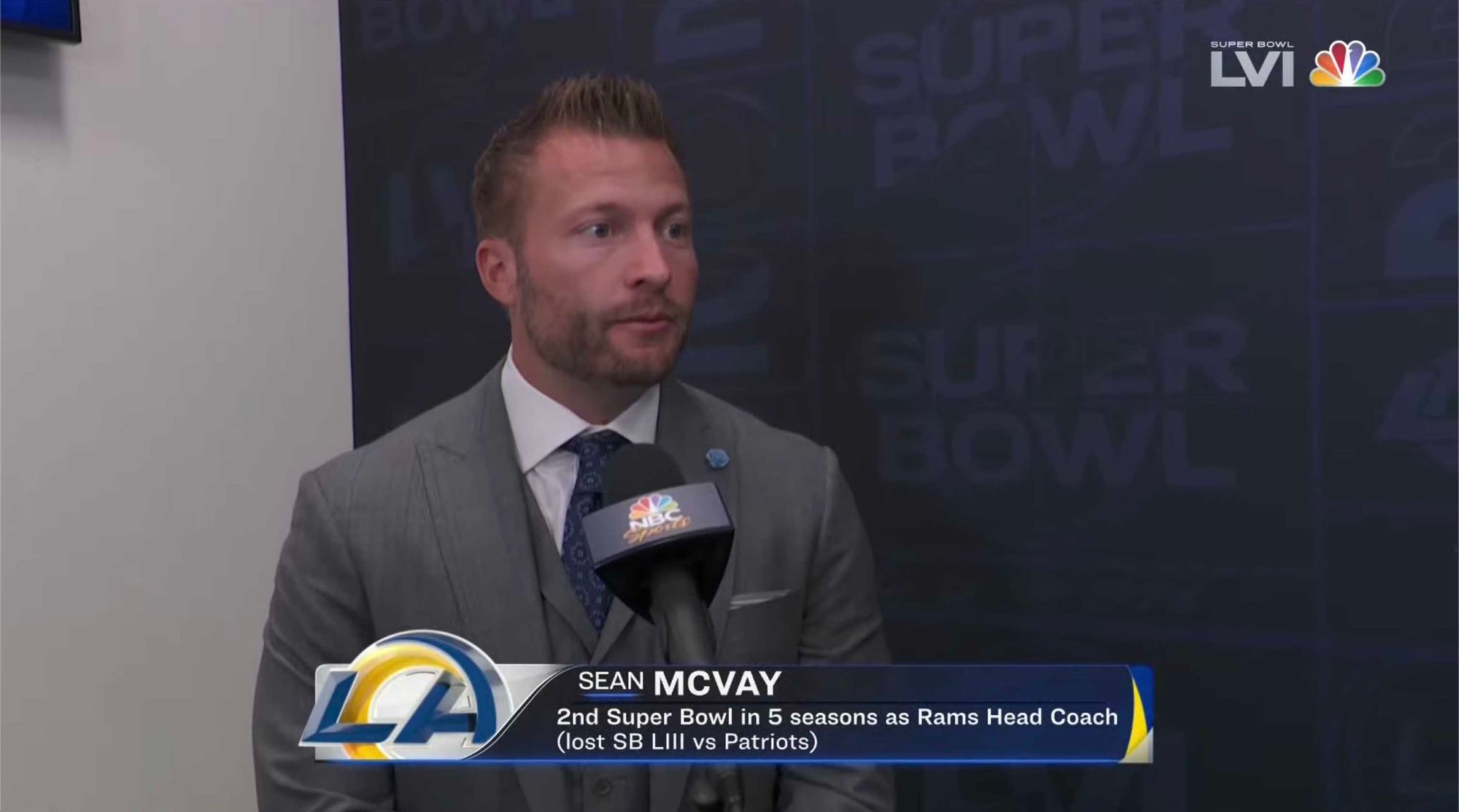
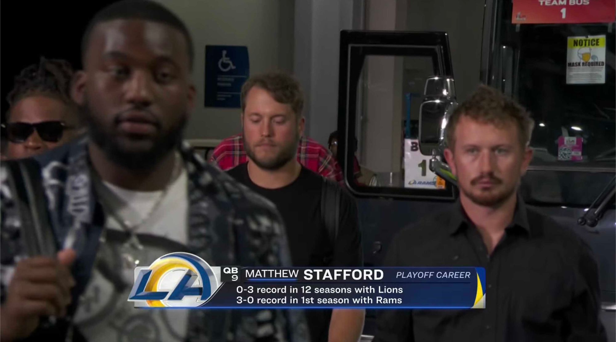
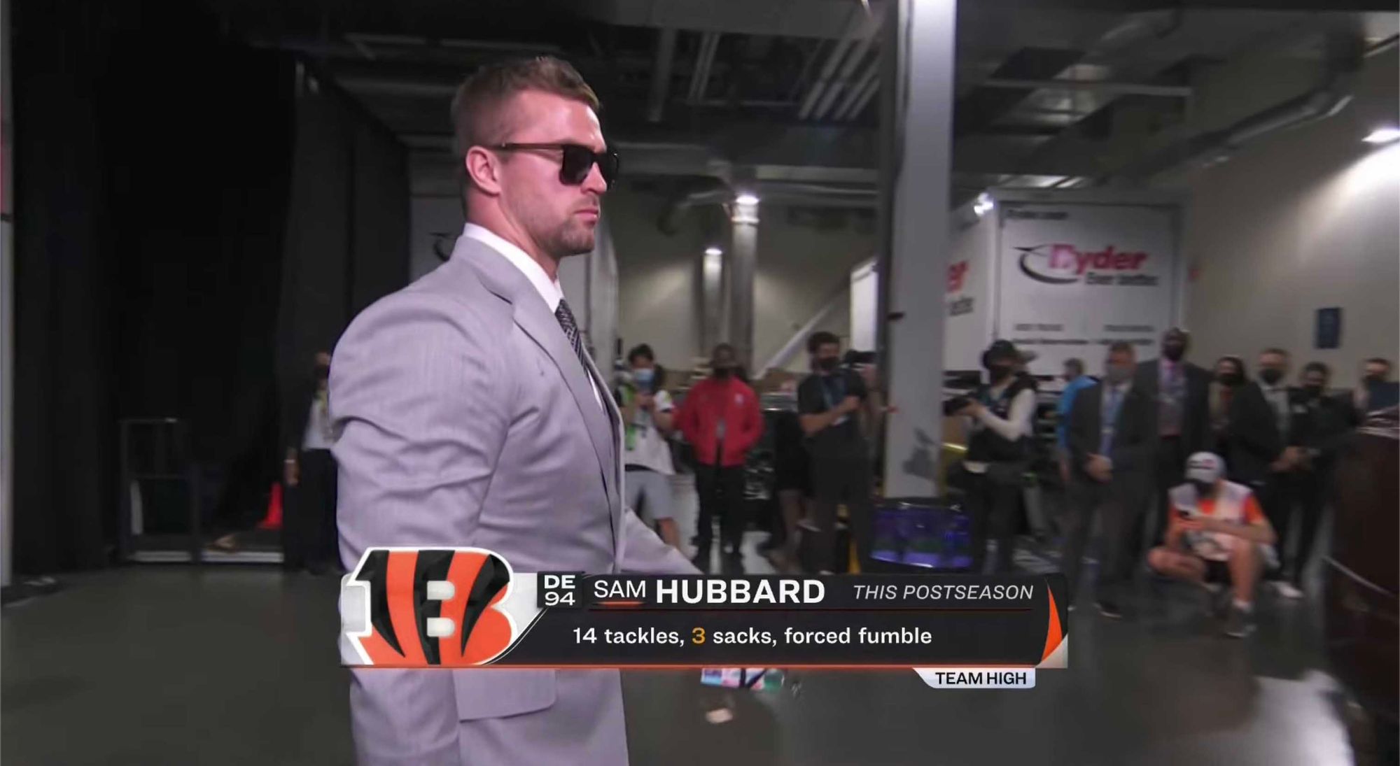
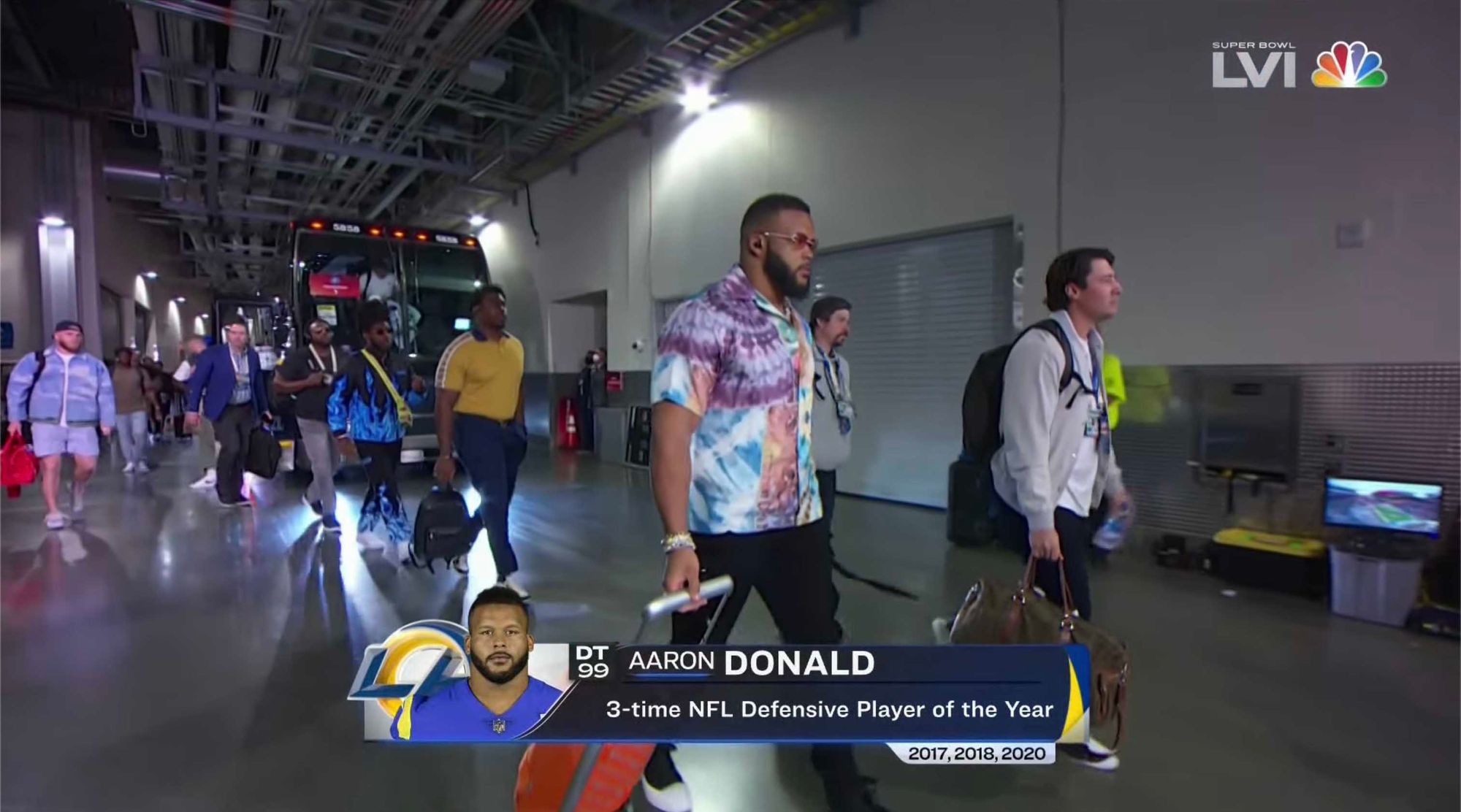
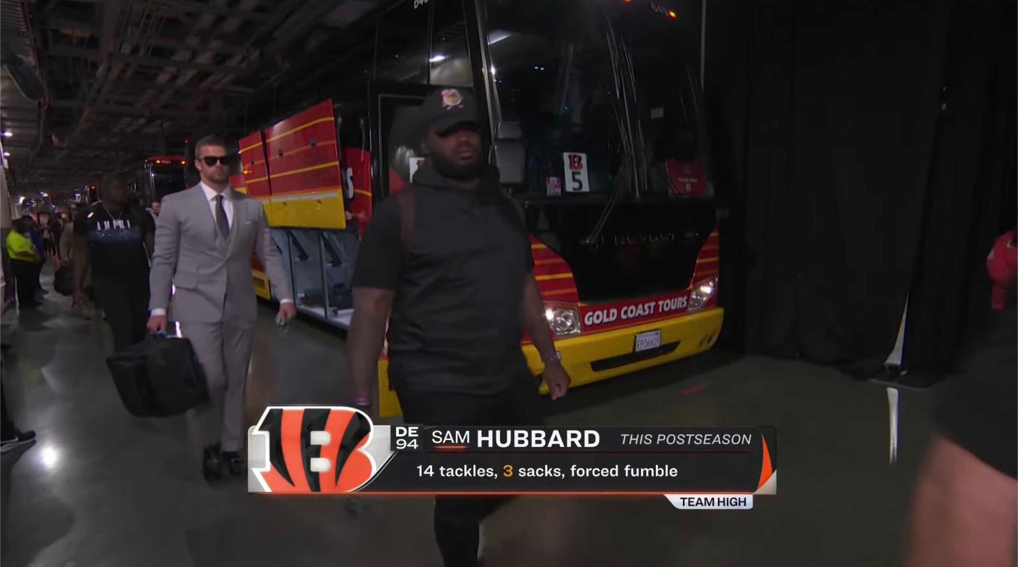
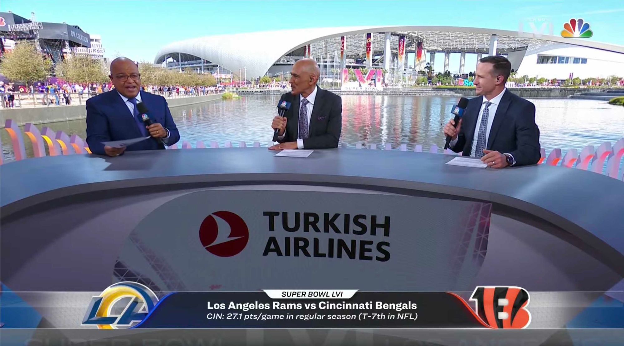
Up to this point, the layout is almost the same as all the other networks. But check out what they do when they want to show a headshot and a team logo.
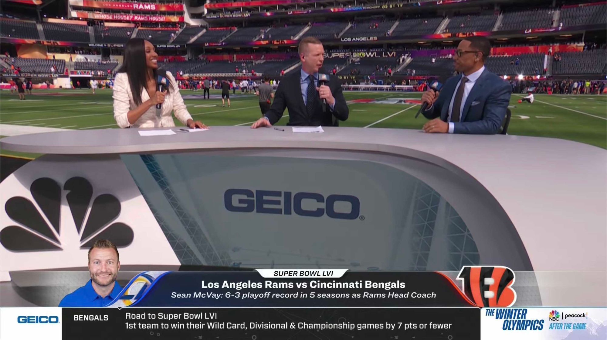
Most networks put the logo over Sean McVay's right shoulder, but NBC has elected to "squish" it between the headshot and the primary text area. Seems risky because the team logo is going to be very hard for viewers to identify.
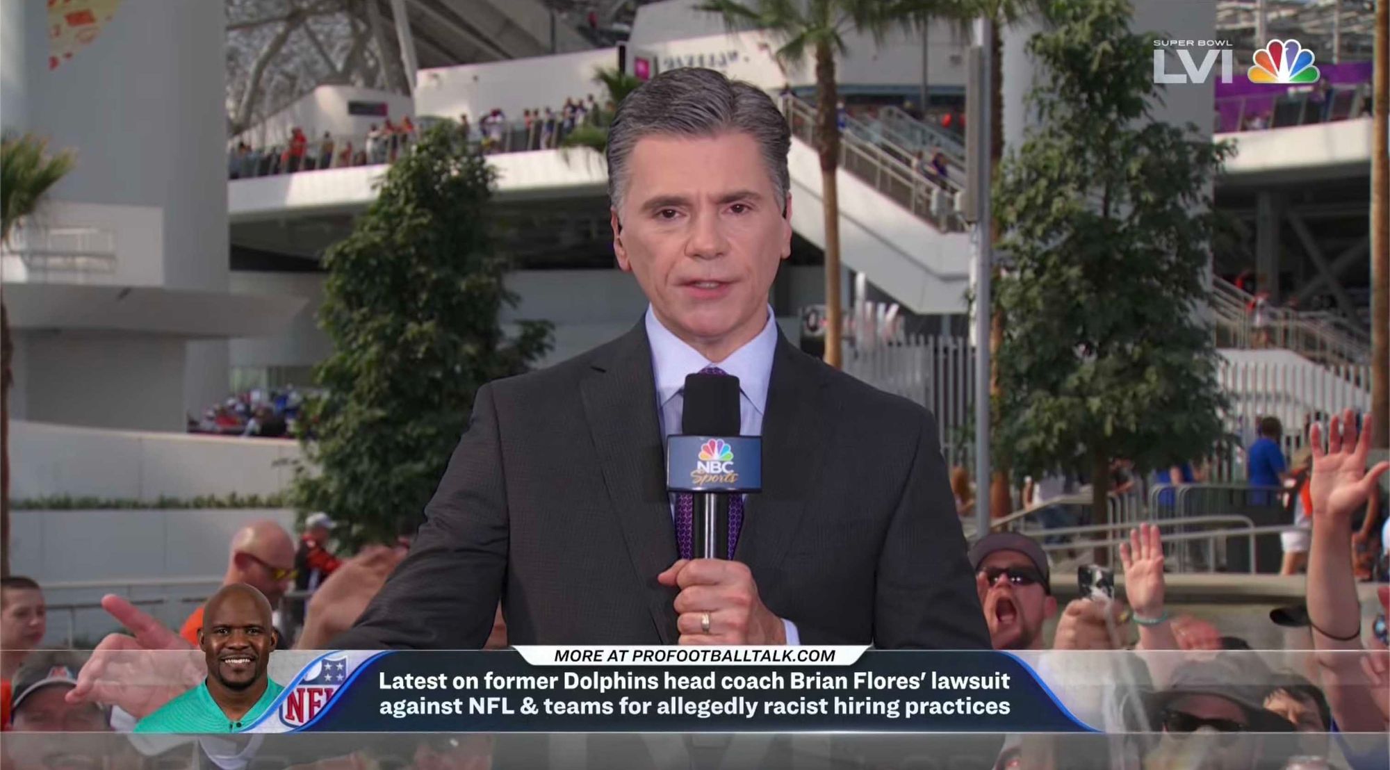
Now the NFL logo is pretty easy to recognize, but it's also one of the most recognizable logos ever. It's impossible to think any logo in that slot will be easily identifiable when you consider all of the logos in the sports world: NFL, NCAA, and beyond.
Bold decision. We'll see if it pans out.
Lower Thirds: Slim
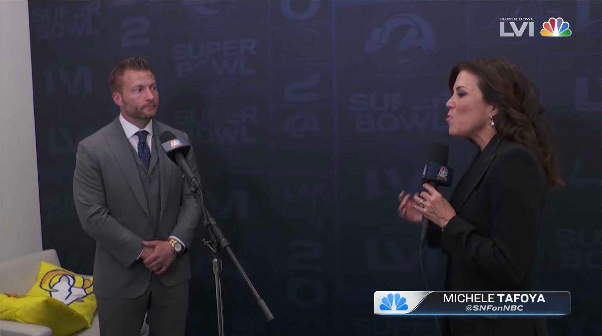
Worth noting two things
- The Twitter logo is not present, but the Twitter color is. Notice how the NBC peacock is overlaid with that unique blue of Twitter's primary color. (They still have the rainbow logo in the top right.)
- Note how the title line is for NBC's show (@SNFonNBC) instead of Michelle Tafoya's Twitter handle
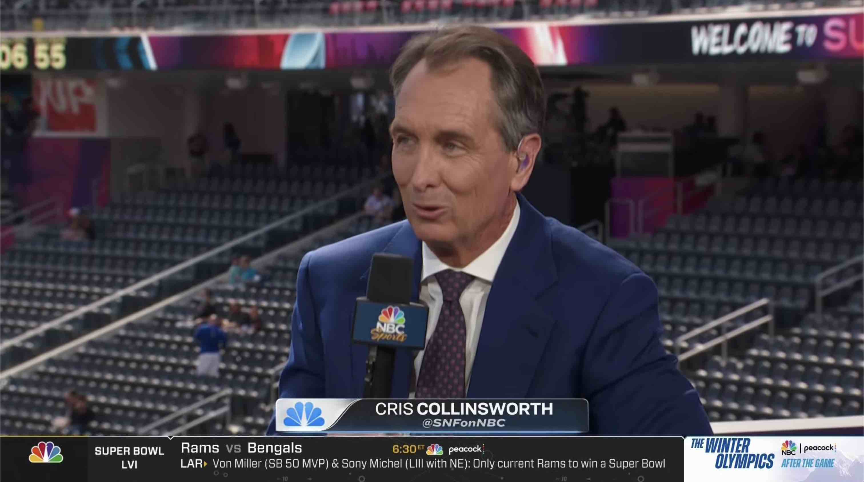
Now this one's weird because it's slim, aligned to the top left, and takes more of the visual cues from the standard lower thirds than the slim ones.

Corner Box

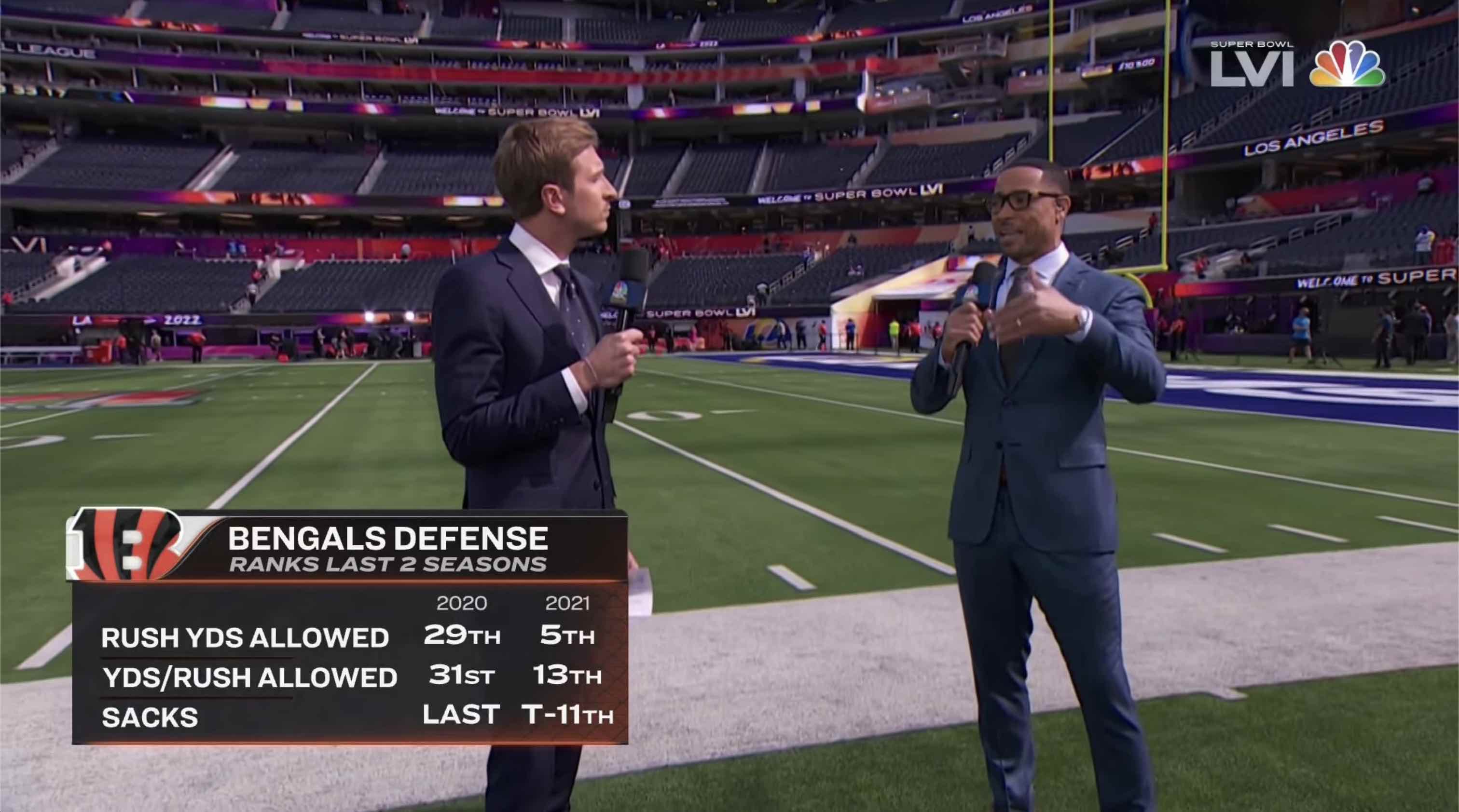
Classic layout, but they're so clean.
Split views
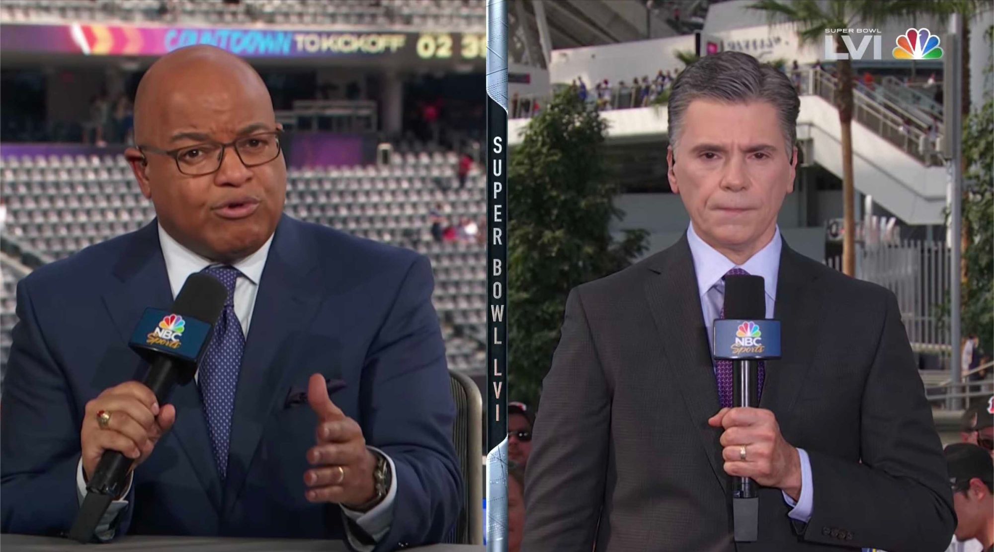
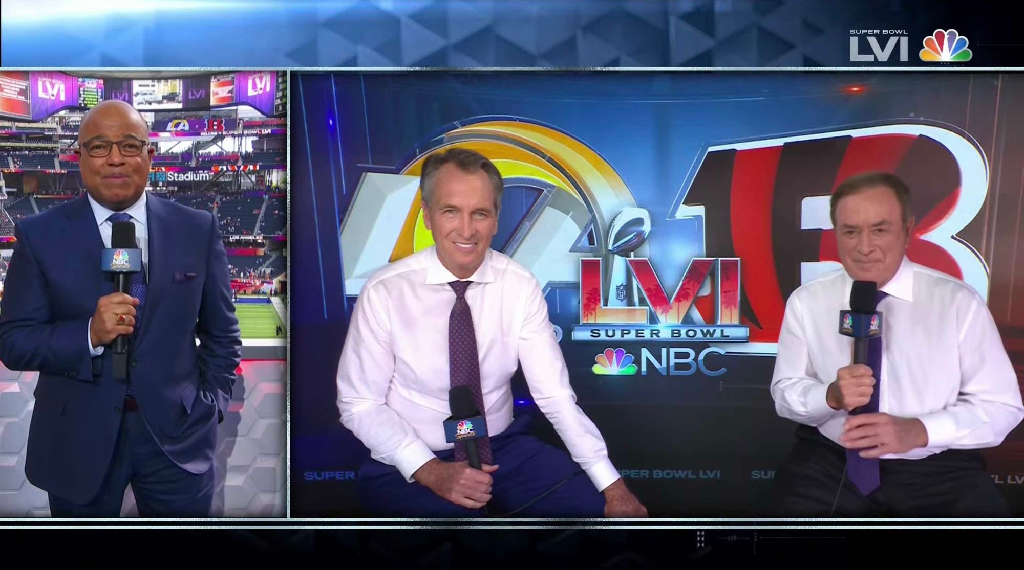
Ticker
Surprisingly, the ticker looks the same as it has been. Looks like the smooth lines of the new lower thirds clash with the straight lines and angled corners of the ticker

Conclusion
When it comes to broadcast graphics, NBC Sports historically sits on a throne above all competitors After watching today's Super Bowl Pregame Show, it looks like we have 3 or 4 more years of the NBC peacock thinking it's better than everyone else.