Why the Washington Commanders Rebrand Missed the Mark
The Washington Commanders rebrand has been out for a few months, and after receiving less than favorable reviews, they've already made a change. What went wrong with the rebrand?

I received a lot of good feedback on my post about the Washington Commanders rebrand. While the rebrand had some good elements, in the end I couldn't help but conclude the brand was generic and forgettable.
This morning I found the explanation from the company hired to create the new brand—Code and Theory—and I think I figured out why the rebrand missed the mark (and why they've already had to tweak the crest).
Was it crafted by sports fans?
Code and Theory sought to build "the most inclusive sports team brand—ever."
I’ve spend thousands of hours in the sports industry, and the only individuals who would use the phrase “sports team” in any context are non-sports fans.
If you're in the sports industry, you would reword the objective to something like "the most inclusive sports franchise—ever."
But if you don't understand sports, you're liable to think the 'sports team' plays the 'sports game' on the 'sports field' with the 'sports ball'....
Okay, a bit tongue-in-cheek. But they were aiming generic, and I think they hit the nail on the head.
Also, check out this new* crest for Washington.
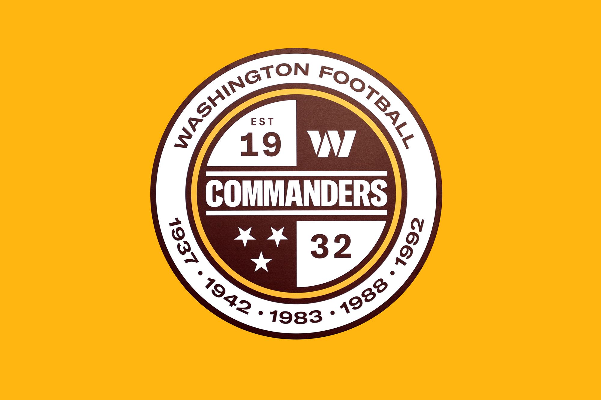
Setting aside the design faux-pas of:
- Using three (or more?) fonts in a single logo,
- Including SIX different years,
- And designing a crest that does not scale down well at small sizes...
This design strongly resembles international football, not American football.
Examine the Commanders' crest next to the English Premiere League logos.
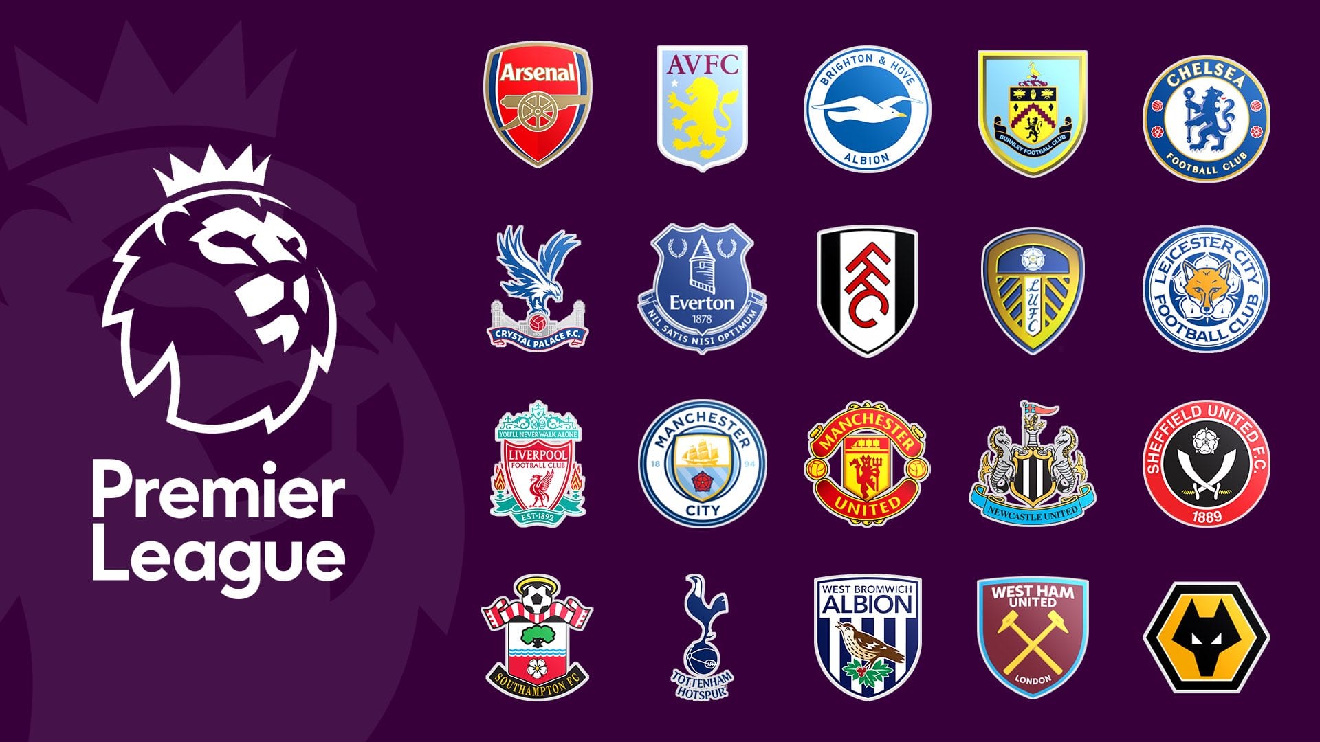
The crest says "football," much like Liverpool or Leichester City.
A friend commented that the three stars in the Commanders' crest also resemble the three stars in the (very-American) Major League Soccer logo.
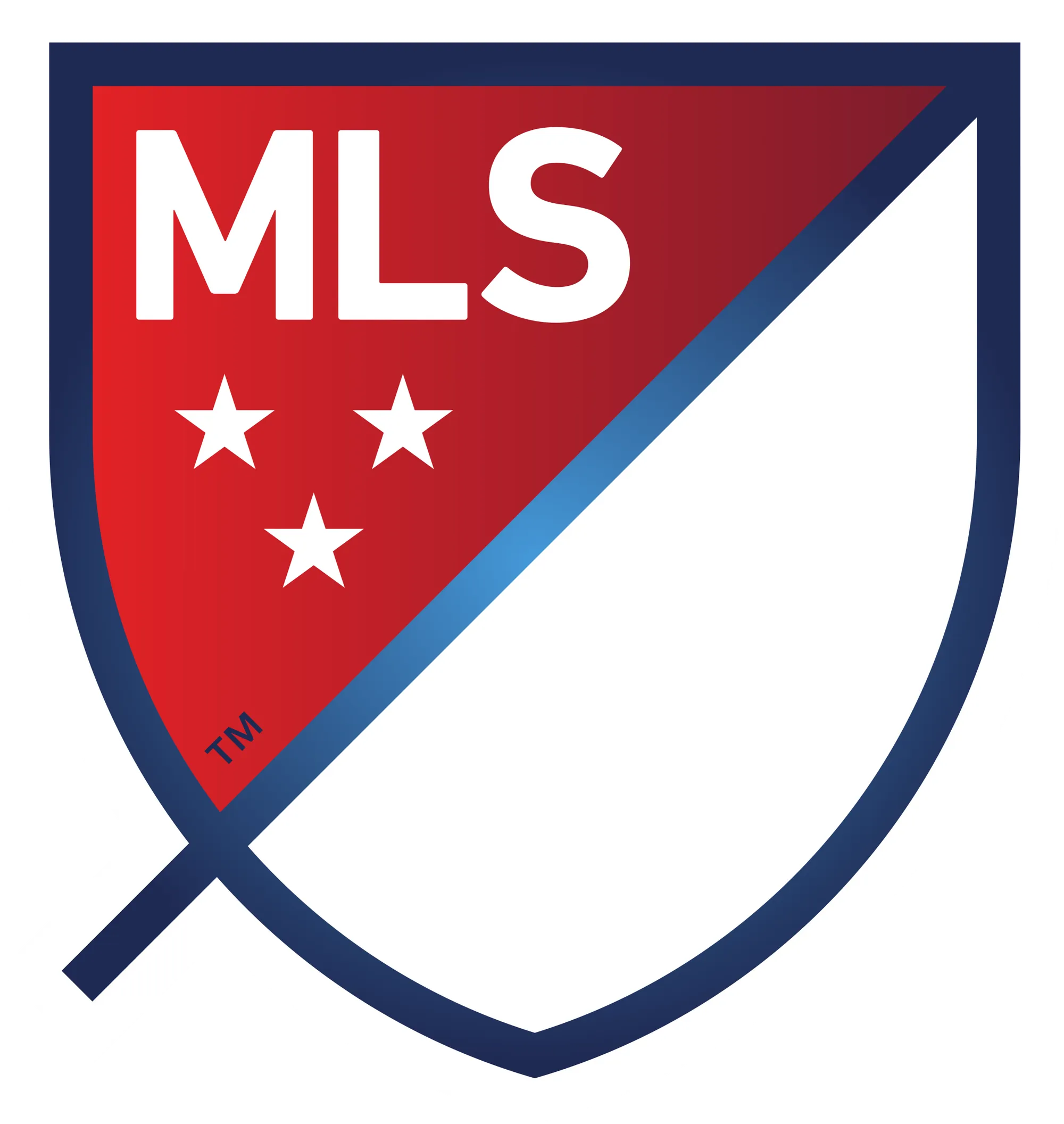
But back to the Commanders crest.

Visually, this doesn't say American football because it's so generic.
Which, when I think about it, fits well with the objective of creating an identity for a "sports team." 🤷🏻♂️
Lastly, you can tell this wasn't crafted by sports fans because....what happens to the crest if Washington wins another Super Bowl?
If you're going to design an identity for a franchise grow into, don't make it possible for the team to outgrow it in less than a year.
The Knock-Off Brand
In Code and Theory's design reasoning, they went to great lengths to explain that this rebrand is deeply rooted in inclusivity. In fact, they use the word “inclusive," or a varying form, 8 times in their brief. (By comparison, the word “football” was only used once when not referring to the "Washington Football Team").
The goal was inclusivity, not so much the NFL, football, or Washington DC.
But why inclusivity as the focus?
Well, the Redskins nickname was deemed not inclusive, and if you're going to go through the trouble (and expense 💰) of a full rebrand, you do not want to go through that process again.
At the end of the day, the emphasis on inclusivity is inseparable with the former nickname.
This leads to the design philosophy being built around NOT being the Redskins more than it is built around BEING the Commanders.
This is what I call the 'knock-off brand,' where a brand's equity is inescapably rooted in its imitation or rejection of another brand.
And it never works.
Someone knocked-off YouTube and called it GodTube.

No matter how good the content on GodTube will be, it's ultimately a knockoff of YouTube and sounds like a website where you're going to get three popup ads for hot singles in your area.
Mike Huckabee's campaign for President in 2016 is one of the more recent knock-off brand attempts, where his entire marketing strategy centered around knocking off the well-crafted Obama brand.
- The rally cry "From Hope to Higher Ground" draws from Obama's "Hope" messaging
- The logo imitates the horizon in Obama's famous O.

The Huckabee strategy meant that his unique identifier was that he was not the guy already in office. But there are already 300+ million Americans who aren't Obama; what made Huckabee special? (Apparently not much because he ended his campaign shortly after it launched.)
The knock-off brand can never work.
The Washington Commanders brand was built around not being the Redskins, and that led to the visual identity being too generic.
The design philosophy should have been to go all-in on being the Commanders. Identify the great Commanders in American history and incorporate that into the identity.
Already changed the crest?
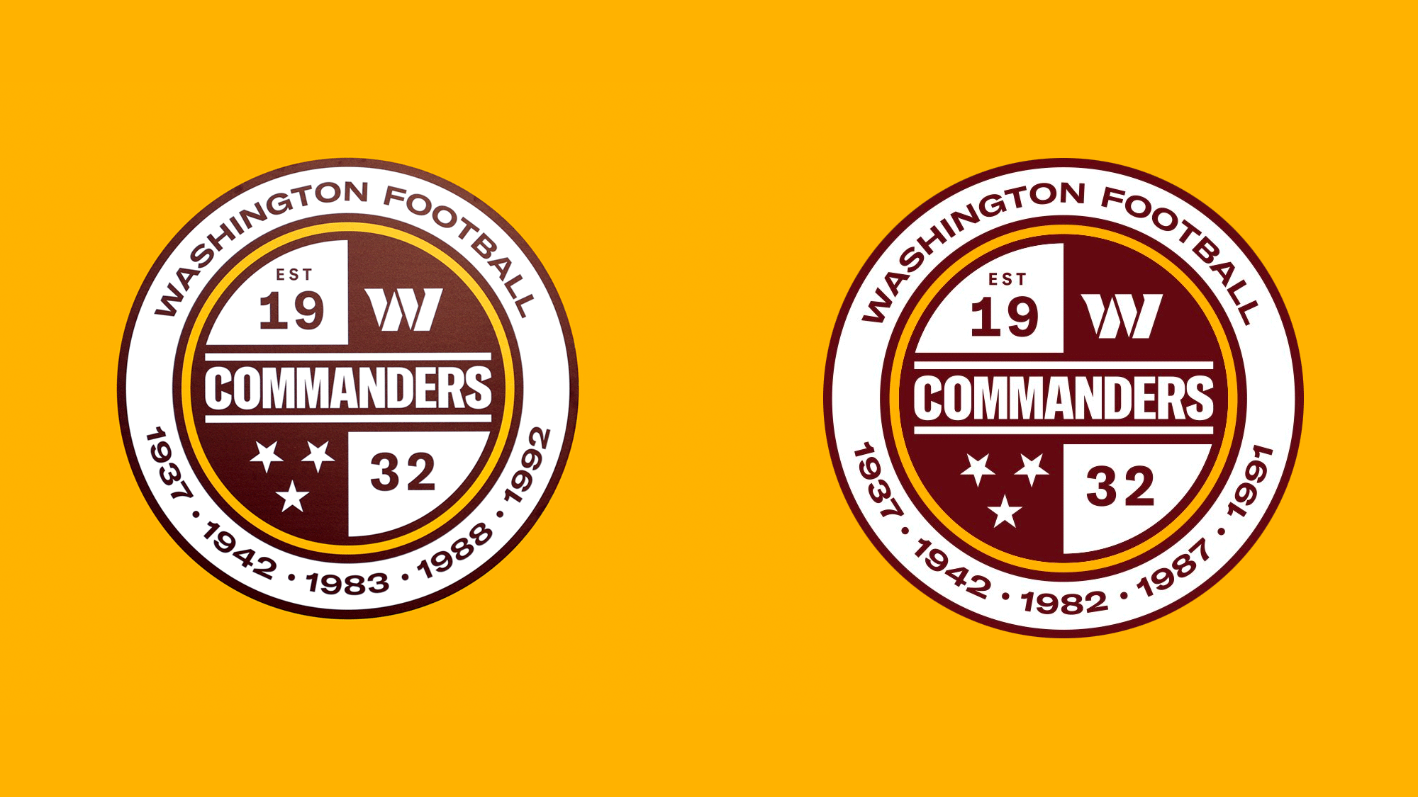
There was confusion as to the years on the crest that represent the Super Bowl winning seasons. The crest originally had the calendar year of the Super Bowl win, not the year the season started (as is custom in the NFL).
Well, it's been changed.
We heard you loud and clear
— Washington Commanders (@Commanders) February 22, 2022
Going forward, our crest will reflect our Super Bowl victories using the year from that regular season pic.twitter.com/irndw0DyaK
But you keen-eyed readers will notice they also removed the gradient background of the crest, which was previously lighter in the top-right.
Is it really that bad?
Embracing the rebrand of a beloved team remains a tough ask for any agency aiming to please a franchise with a vast and passionate fanbase. The new identity has to be unique enough for the franchise to grow into over time but familiar enough to maintain the existing brand equity.
In execution, the Washington Commanders concept feels like it was birthed from a brief that stated, "Give us a new nickname, get people to forget we were ever the Redskins, and don't you dare touch our colors."
Ultimately, they tried to please everyone and ended up splitting the difference, which is why we're left with a decent high school or college brand that comes up short of encompassing the glory of one of the world's most iconic sports franchises.